


Ever since React came into existence, and we got to know about JSX, writing Javascript logic within HTML made our life all roses and sunshine. But with this modern art of writing code, still writing a style.css, for styling our React Components is somewhat off putting.
So here i'm presenting before you 2 elegant ways to style your react components.
This article explains all these methods through a very basic example having two buttons - primary & secondary.
Writing CSS as objects
This method is nothing but inline styling with slightly refactored code. Our project is a basic React Application,our project structure looks like-
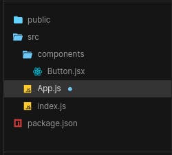
It just contains an App.js file which is our root component,and our Buttom component is imported here.
Here's how App.js looks-
import Button from './components/Button'

export default function App() {

  const container = {
    width: '100%',
    height: '100%',
    display: 'flex',
    justifyContent: 'center',
    alignItems: 'center',
  }


  return (
    <div className="App">
      <div style={container}>
        <Button primary/>
        <Button secondary/>
      </div>
    </div>
  );
}
Important thing to notice here is how the styling is being done, and as it seems obvious it isn't some rocket science just inline styling written in different way. But it makes our code look cleaner.
So you might be wondering what are those primary & secondary props doing ?
Well, you'll get it in just a moment. Now let's have a look at our Button.jsx file-
import React from 'react'


const primaryStyles = {
  height: '40px',
  width: '120px',
  borderRadius: '20px',
  background: '#01bf71',
  color: '#fff',
  display: 'flex',
  justifyContent: 'center',
  alignItems: 'center',
  margin: '10px'
}

const secondaryStyles = {
  height: '40px',
  width: '120px',
  borderRadius: '20px',
  border: '2px solid #01bf71',
  background: '#fff',
  color: '#01bf71',
  display: 'flex',
  justifyContent: 'center',
  alignItems: 'center'
}


const Button = (props) => {

  const {primary,secondary} = props

  return (
    <>
      <div style={primary ? primaryStyles : secondaryStyles}>
        CLICK ME
      </div>
    </>
  )
}

export default Button
Here we have declared two objects - primaryStyles and secondaryStyles,which are nothing but css for styling our buttons.
First we destructure our props,it isn't mandatory but it's best practice to do so. Then while rendering our button div we finally check which prop has been passed to the Button component by using a ternary operator.
So if primary is passed then our ternary expression will evaluate to primaryStyles else secondaryStyles.
If you want to learn what ternary operator, refer this.
And the corresponding style will get applied to our Button.
Using Styled Components
Styled Components is a library that lets you write actual CSS in your Javascript, isn't it the climax of our partial story, Now you can write Javascript within HTML and CSS within Javascript.
This is the cleanest and the most modern way of writing CSS.
If you want to know more about it,please refer this.
You can install it by running: npm install --save styled-components
Once you've installed it, just create a new component StyledButton.jsx, which looks like -
import styled from 'styled-components'


export const CustomButton = styled.div`
  height: 40px;
  width: 120px;
  border-radius: 20px;
  border: ${props => props.secondary ? '1px solid #01bf71' : null};
  background: ${props => props.primary ? '#01bf71' : '#fff'};
  color: ${props => props.primary ? '#fff' : '#01bf71'};
  display: flex;
  justify-content: center;
  align-items: center;
  margin: 10px;
`
If you carefully observe styled components gives us the leverage of accessing props directly, so that we can use them to dynamically change our CSS as we want.
And if you can see, this also shortens our code than the previous method.
Now we just need to import this CustomButton component in our App.js and pass our props.
import Button from './components/Button'
import {CustomButton} from './components/StyledButtons'

export default function App() {

  const container = {
    width: '100%',
    height: '100%',
    display: 'flex',
    flexDirection: 'column',
    justifyContent: 'center',
    alignItems: 'center',
  }


  return (
    <div className="App">
      <div style={container}>
        <Button primary/>
        <Button secondary/>
        <h1>Styled Buttons</h1>
        <CustomButton primary>CLICK ME</CustomButton>
        <CustomButton secondary>CLICK ME</CustomButton>
      </div>
    </div>
  );
}
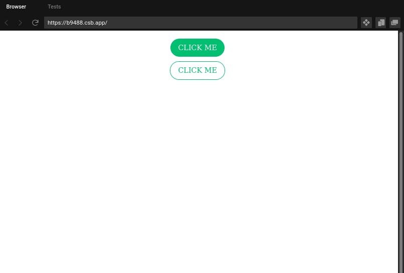
And our final output looks like-
So now you see how easier and elegant it is to use styled components in your React App. Hope you enjoyed the article and are willing to use in your future projects.
Keep Cyberforming!
Sigining Off...